Showing posts with label 2D Art. Show all posts

Tuesday, January 25, 2022

Digital Asset Creation - Sprint Delivery 1

 Contributions

        Character Concept Art Turn Arounds & References

        Building Sound Repository 

        Script Development


Thursday, November 11, 2021

Digital Asset Creation - Week 12 - Starting Prototype

 Contributions

    -Characters

    -Shape Language

    -Iconography

    -Game Pillars

    -PowerPoint Development


Wednesday, October 27, 2021

Digital Asset Creation - Week 10 - Art Style Analysis

 PowerPoint Contributions

    -Characters

    -Shape Language

    -Iconography

Art Style Analysis


Thursday, October 21, 2021

Digital Asset Creation - Hero's Journey Story

 Contributions 

        -Story Development

        -PowerPoint Development 


Thursday, October 7, 2021

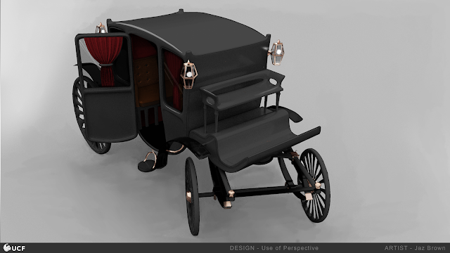
Digital Asset Creation - Week 06 - Use of Perspective


 This week we had to model a form of transport and use that as a base line for perspective. I chose to model this old carriage because I thought it would look a little spooky for October and allow me to add in some interesting details. 

The model is very primitive, and I used it to establish a baseline of lighting and scale. 


Once the model was finished, I imported it into photoshop and began painting on the colors and details. I wanted to keep the color palette dark with pops of red and the bright metallic gold for contrast. 


Grade: 95

Thursday, September 30, 2021

Week 5 - Use of Composition

 This week we had to choose a target artist to mimic the style of while creating are with one of the composition styles. I chose the artist Moebius because I liked his use of line art and bright warm desert scenes. Some of his work was also very surreal which inspired me to create something in that realm. 


I decided to use a similar environment in the desert so I could use these harsh contrasting shadows and bright reds and oranges. I also wanted to incorporate some interesting back lighting and silhouettes. Additionally, Moebius style has some watercolor qualities that I attempted to replicate in digitally. 


Grade: 95

Thursday, September 23, 2021

Digital Asset Creation - Week 4 - Use of Basic Lighting

 For week 4 we used a unreal file to assign materials, arrange primitive shapes and set up lighting. Then we took a high res screenshot and recreated it using digital drawing.

I really enjoyed painting this image!. One of the things that we had to emphasize global illumination, meaning the color that bounces around the scene. I think the most apparent places in this image where that light appears are the shadow on the cube that has a purple cast from the triangular prism and the red reflection on the white sphere. 

There's also some more subtle illumination bouncing purple light from the prism and blue light from the cone onto the ground. There's also some red from the capsule on the cone.
There's a good mix of more basic materials and more challenging ones in this image. The harder ones are the chrome, emissive donut, and glass pyramid. It was difficult to make them look like the image but I'm very happy with the results.

Grade: 100

Thursday, September 16, 2021

Digital Asset Creation - Module 1 Week 4 - Value


This week our assignment was based on value and contrast. We took existing line are and added our own value and lighting. There is general lighting to create a three dimensional effect and then added a rim light around the edge of the characters. One of the challenges I had with this illustration is that one of the principles we discusses was that lighter colors draw the attention to that part of the illustration, but with her dark skin I couldn't make her face too different from her skin tone. To combat that challenge I added a lot of lighter colored jewelry around her head.


Grade: 85

Thursday, September 9, 2021

Digital Asset Creation - Module 1 Week 3 - Use of Silhouettes


In this assignment we were tasked with using thumbnails to create designs that would change the shape of the silhouette of a public domain (or Nintendo) character. I chose to redesign Cinderella with a Norse/Viking theme because I thought the variety of weapons, armor, and furs could dramatically change the shape of the character. I tried to keep some elements consistent to refer back to Disney's version of Cinderella as that is likely the first association that the audience would make. In these thumbnails I tried to keep her body type and face shape consistent. I also kept her blunt round bangs and hid her ears like the Disney design. I also wanted most images to show her shoes so if the design continued to be iterated on I could make glass slippers or boots to refer back to the fairy tale.


The second part of the assignment was to black out the thumbnails as a silhouette. I think some of these silhouettes are more successful than others. I think A is interesting but the body gets lost, and B is similar. C really invokes classic Cinderella posing, so I think that one is very successful in referencing the original character. D, F, G, and H all have the weapons to add interest to the silhouette and I think those are some of the best. Many of the designs have capes or shawls and as bulky clothing items they're especially a challenge to avoid losing the silhouette, but I think despite that they still have interest.


Grade: 100

Friday, September 3, 2021

Digital Asset Creation - Module 1 Week 2- Use of Basic Shapes


Circular shape language implies softness, approachability, and comfort. I tried to make the round creature look soft and kind. I gave it big, round eyes, and a softer shaped body to imply that it is friendly. I also thought that tentacles would reinforce the circular shape language because of the repetition of the suckers. The beak was softened as well to try and suggest that this creature is not harmful.

Square shape language implies that something is study, stubborn, or rigid. The square creature is likely very sturdy because of his composition of rocks and lava. I reinforced that rigidity in the shape or the torso, face, and fists. Even smaller details like the lips and irises are square to add to that impression. My favorite part was using color dodge and luminosity layers to make the lava look like it's glowing.

Triangle shape language implies danger, dynamic, and unpredictable. This creature looks the most dangerous out of the three because of its long sharp horns and nails. The triangles are everywhere in this design: the wings, the bull's head, and the tips of the fur. The use of bones also allows for sharper edges that continue to allude to the triangular shape language.

Grade: 93

3D - Seahorse Weapon - Textures and Final Renders

  Schedule         Week 1 : Proxy         Week 2: Sculpt         Week 3a: Retopo, UV,  Material Proxy         Week 3b: Material & Render...